How to Colour Match Clothing
Game, Set, Colour Match
As every stylish gentleman knows, fabric and fit are the two foundations of any well-put-together ensemble. Yet equally important is colour, and particularly how you coordinate and match different hues within your look. If you’ve ever wondered how a certain tastemaker’s outfits look so spectacular, it’s likely they pay close attention to these three areas of style.
Similarly, your favourite brand or designer will adhere to a few basic rules of colour theory in order to produce collections that feel harmonious. It’s the same process followed by interior designers, artists, car manufacturers and across almost all areas of product design.
Two main factors to consider when picking outfit colours
- The colour wheel: to identify differences and similarities between colours.
- Colour harmony: how to pair two or more colours based on a variety of key formulas.
It sounds more complicated than it is. There are simple guidelines to follow, and toy with. Read on to learn more about how we colour match and methods in which a cohesive outfit can be coordinated.
The Colour Wheel
The natural order of colour is red, orange, yellow, green, blue, indigo, violet. You might remember the acronym ROY G BIV from school or Richard Of York Gave Battle In Vain. If you take this colour wheel on face value, the most common theory suggests you match opposites. Blue with orange, for example, or green with red. But in reality these pairings are likely to be too much. Therefore, you must also consider Hue, Saturation and Brightness, to create a cohesive palette.
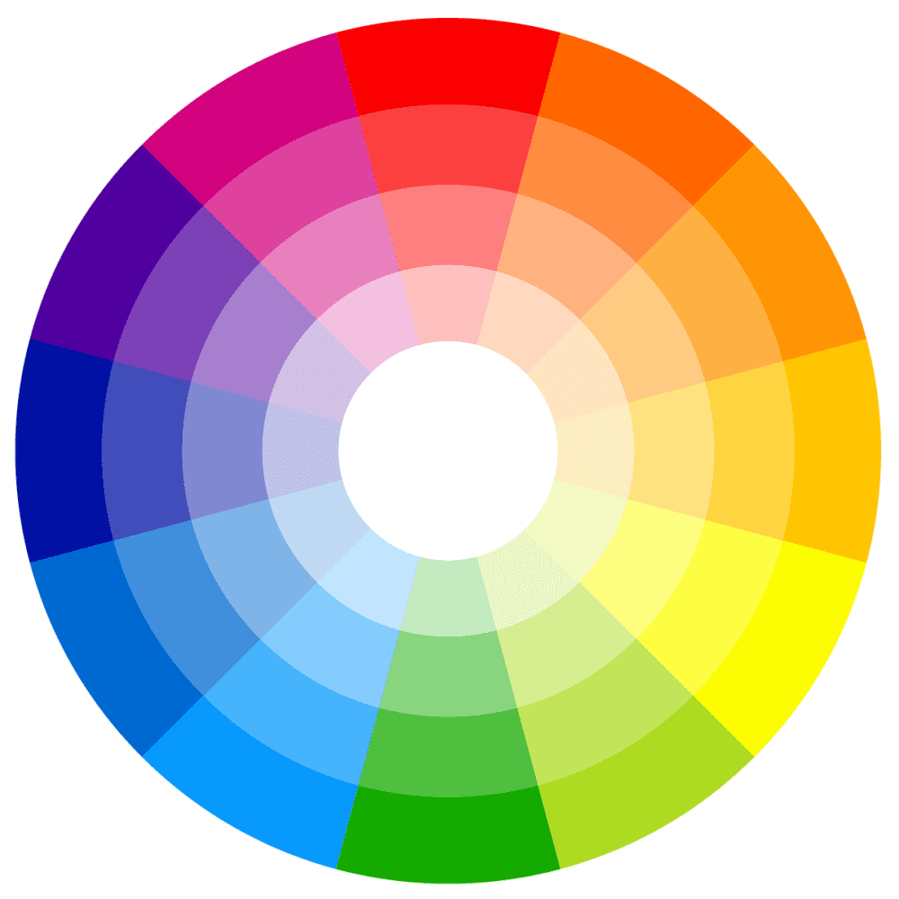
Hue, Saturation and Brightness
Hue refers to a colour’s exact location on the colour wheel. For instance, there are three varieties of orange located around the circumference of the colour wheel; travelling anti-clockwise these lead into red; clockwise into yellow. A hue can be created by mixing a combination of the three primary colours (red, yellow and blue).
Saturation refers to the intensity of each colour (look down the orange triangle in the colour wheel).
Brightness refers to the relative lightness of a colour, from black (0% brightness) to white (100% brightness). This is not shown on the colour wheel.
Combining colours is where it gets slightly tricky, but your overall aim is to cohesively combine contrast. It sounds contradictory but contrast makes your outfit appear more interesting, and marrying colours in the right palette creates cohesion. Think of it as creating a ‘theme’ of colours, if you will, optimised by varying the hue, saturation and brightness levels of each colour in the palette.
To maintain a cohesive palette, you would typically choose two different colours (sometimes one if monochromatic, see below) of the three colour properties (hue, saturation or brightness), but keep the third property consistent.
Neutrals – Black, White and Grey
There are three main colour rules you should follow (although there are more). However, first we must mention neutrals: black, white and greys. Because they have no hue or saturation level they aren’t technically considered colours. This means that they can be paired with any other colour (or together) without disrupting cohesion. The one exception is the brightness level of grey, which can vary, and should be colour matched to the rest of your palette.
You might also pair two or all three of these neutrals together. Think a black Oxford shirt layered open over a white tee with dark grey jeans. Additionally, brown, tan, cream, beige and khaki are considered versions of neutrals, despite being colours in their own right. And navy – being wildly inoffensive and omnipresent – can work well as a ‘neutral’ too.
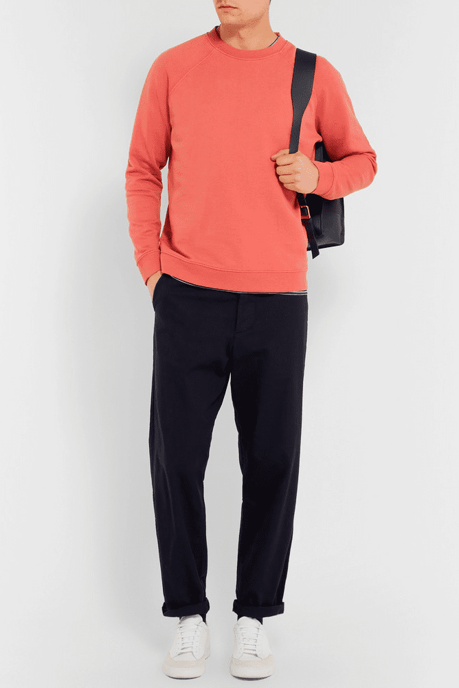
1. Monochromatic
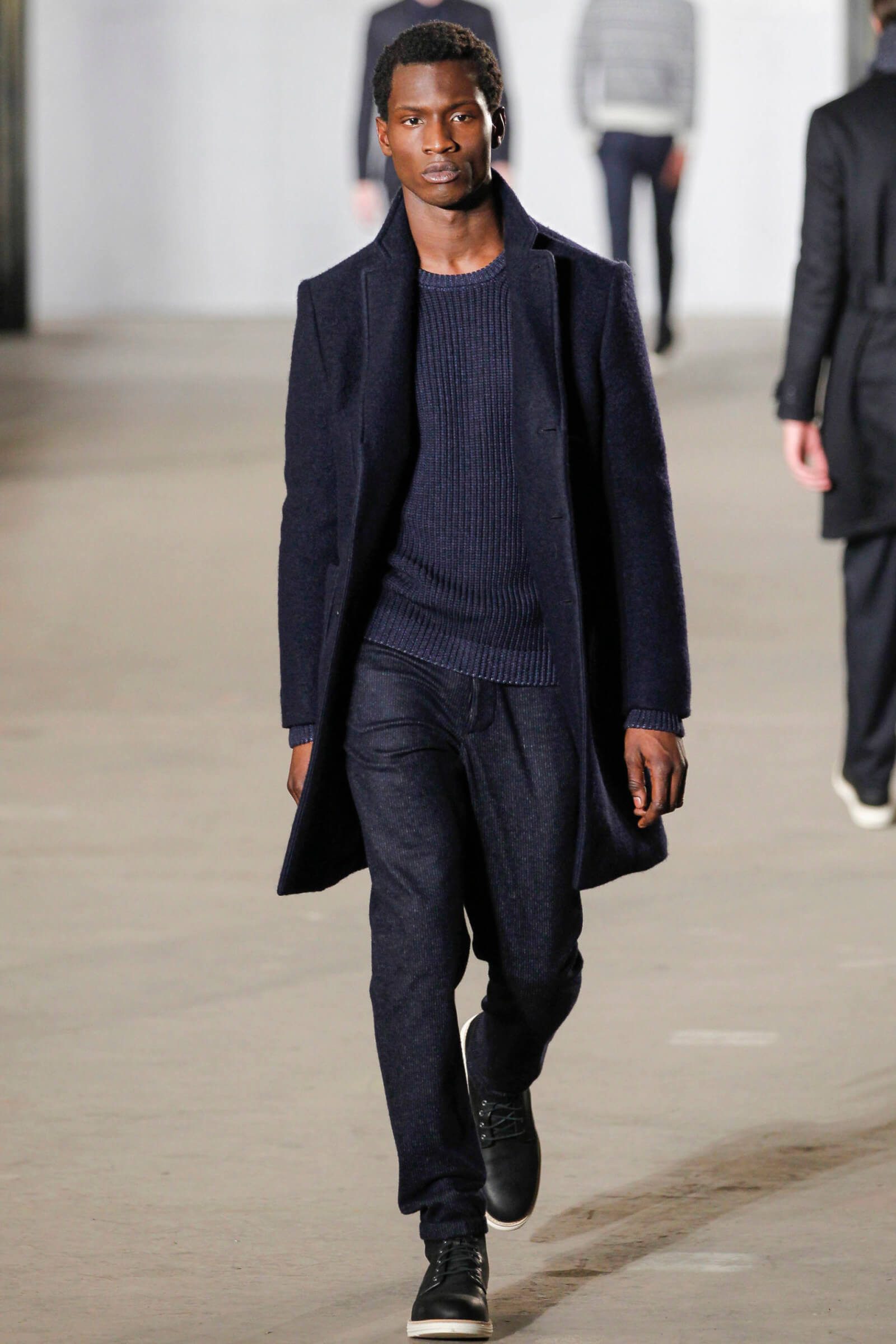
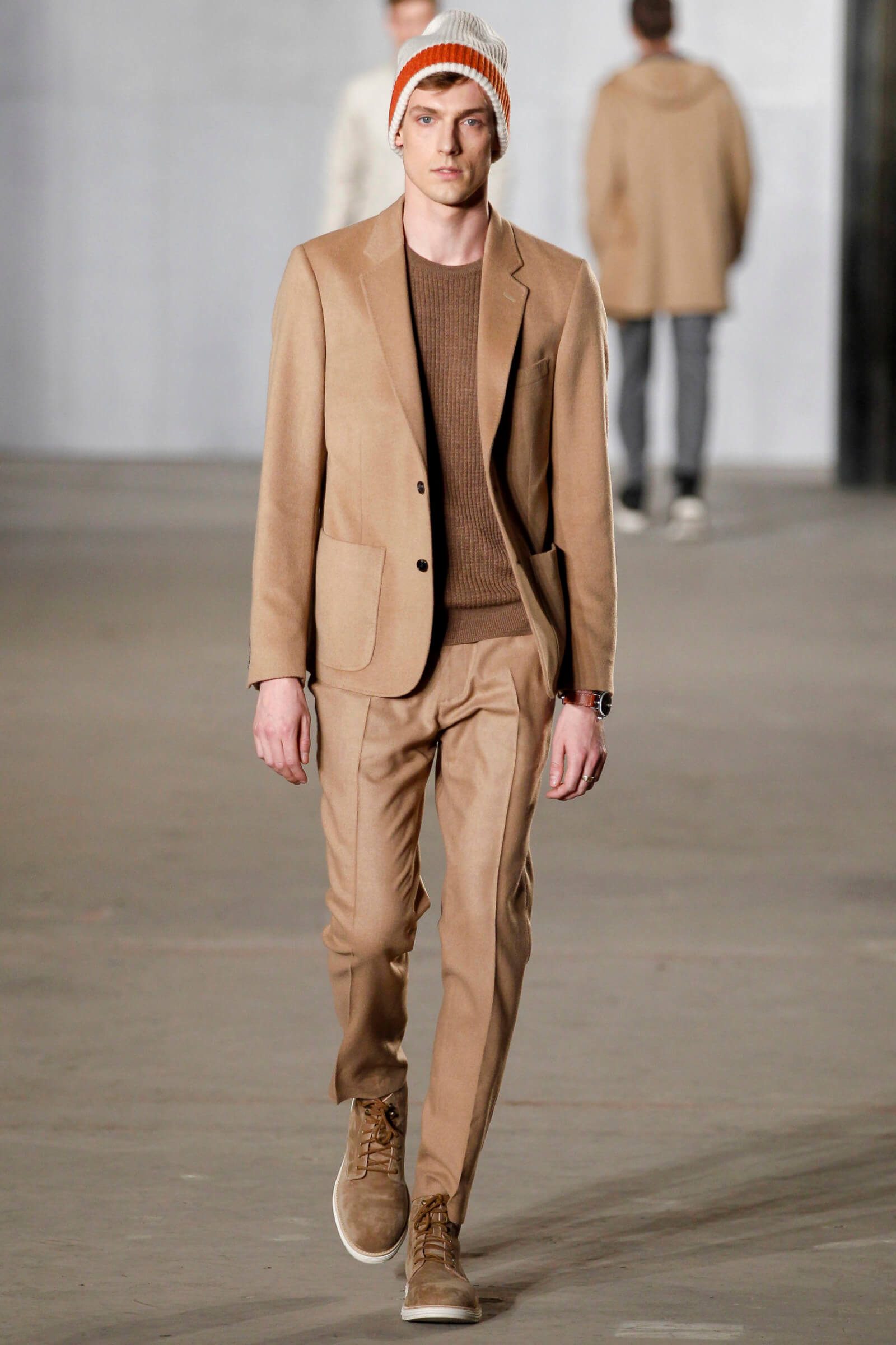
The colours of a monochromatic palette have a single hue, but vary in brightness and saturation. Take a look at the two monochromatic examples from Todd Snyder above. To the left, an all-blue affair with mildly varying levels of saturation and brightness, but the same hue. It’s a similar approach to the brown ensemble on the right. This “tonal” way of dressing is a huge men’s fashion trend this year, particularly when executed in shades of white.
2. Complementary
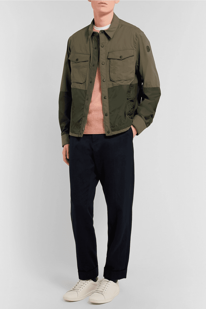
Complementary colour palettes are based on two different, complementary hues that tend to be there (or thereabouts) opposite to each other on the colour wheel. Feel free to mix and match brightness and saturation between the two hues, whilst remembering the colours don’t have to be bold. Think blue and orange (above left), green and pink (above right, with ‘neutral’ navy trousers) or yellow and purple (the Los Angeles Lakers didn’t choose their colour scheme by chance).
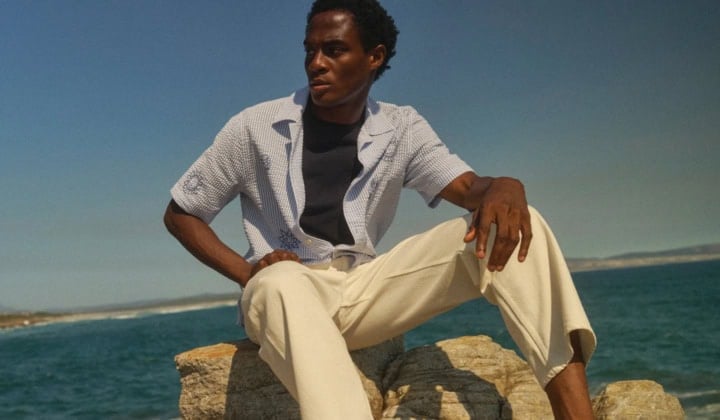
3. Analogous
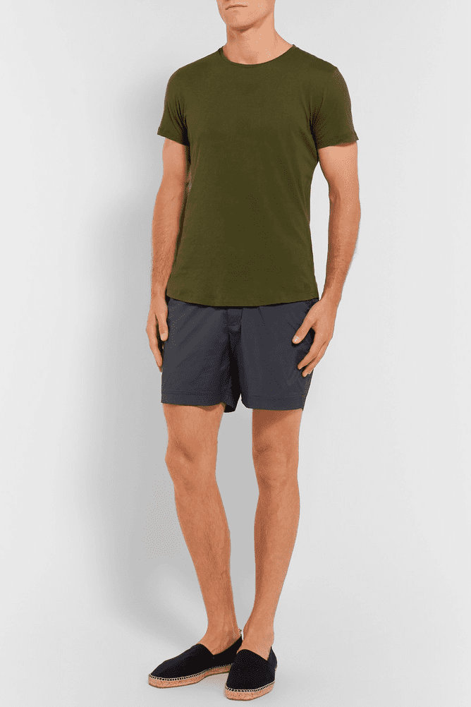
Analogous colour palettes consist of two or three different but neighbouring hues. Ideally you’d keep saturation and brightness the same but it’s okay to mix and match to a point. Green and blue is strong combination, as shown in the green tee and blue swim shorts look above; ditto blue and red, which has long been a go-to suit and tie pairing.
Conclusion
Triad(ic) is a fourth term given to three shades in the colour wheel that are equal distance apart from each other. Pink, green and orange for example. It’s a tricky one to master, so we advise sticking to the three principles above before venturing beyond.
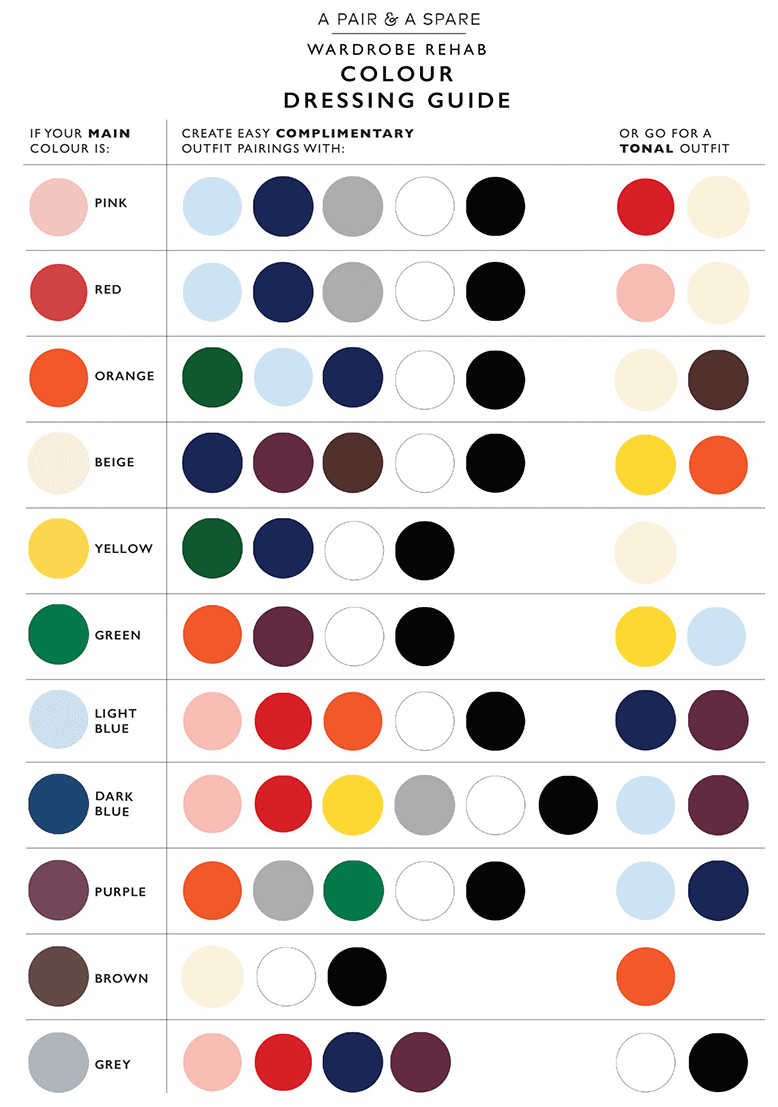
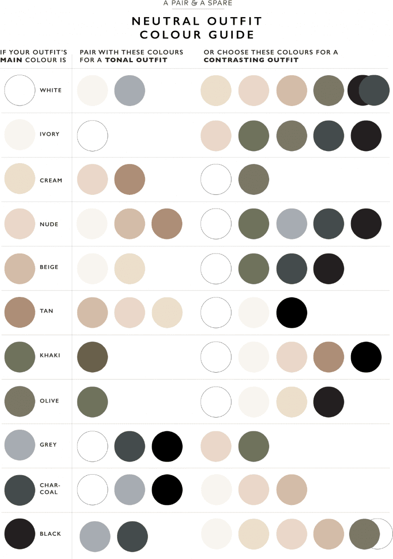
For those looking for a deeper dive into colour matching, the two guides above from apairandasparediy.com are great. Just click on each image to expand to full resolution >
It’s wise to pick colours to suit your skin tone and the occasion. The right half of the wheel is “warm” and ideal for spring/summer whereas the left side of the wheel is “cool” and better suited to autumn/winter. Although, of course, this isn’t a hard and fast rule. And don’t forget, you can always seamlessly combine all three colour rules above with grey, black and white.
Finally, don’t take these guidelines too literally. For instance, buying bold blue trousers and combining with a bold orange T-shirt would check the box of colour matching appropriately. But you must consider all three points – hue, saturation and brightness – for a more ‘civilised’ or toned-down approach to blue and orange. We aren’t peacocks, after all. Always give yourself the “mirror check” before you leave the house, and if you want to wear a particularly colourful piece of clothing – an orange sweatshirt or green chinos, for example – start with this item and then colour match back using the theories above.
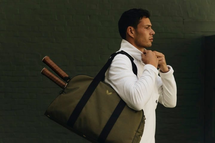
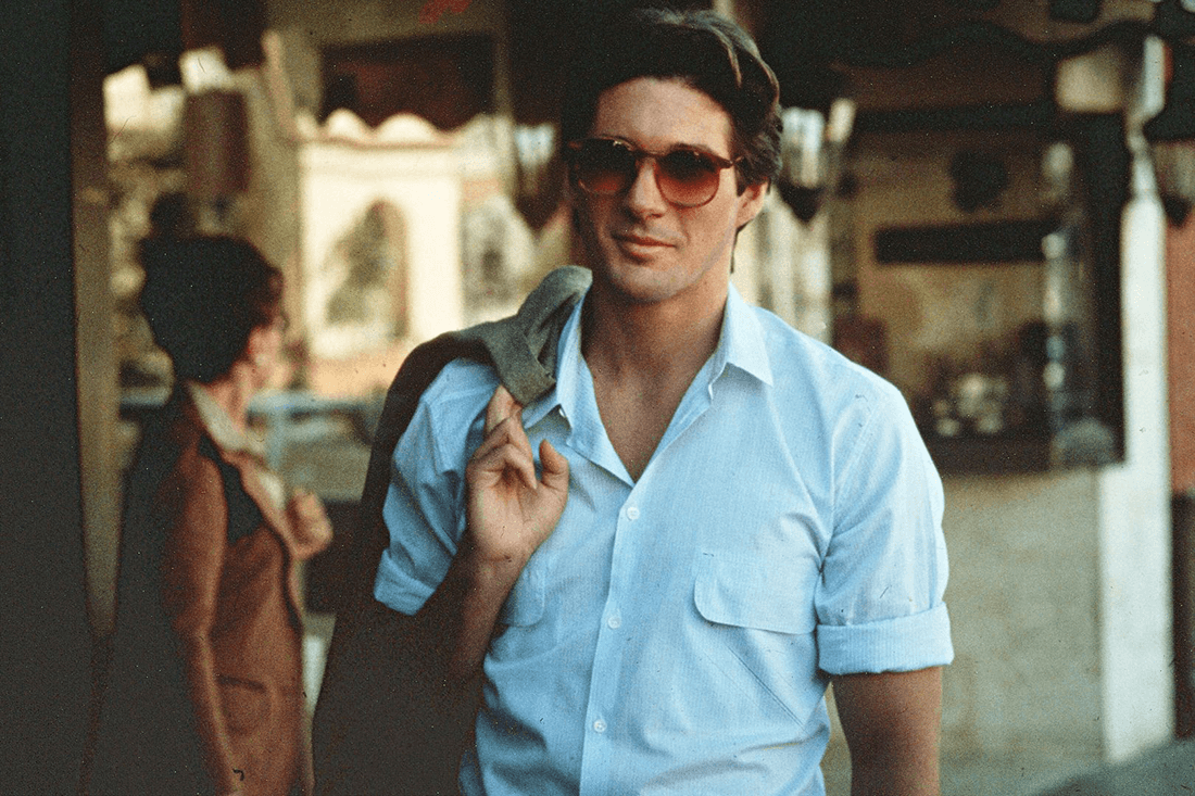
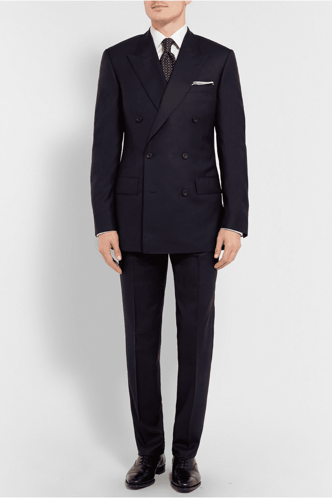
Conversely, you can play it safe with a neutral base then add a highlight colour to introduce a splash of variance. The navy two-piece with red tie outfit above is a good example, with the navy suit being a staple of any man’s wardrobe.